Project
N°016
Name
React Router Brand Update
Company
Shopify
Date
2024
Role
Brand Design
Availability
Live
URL
https://remix.run/blog/react-router-brand-update
About
The Remix team wanted to mark the release of React Router Version 7 with a new logo, so I decided that instead of creating an entirely new brand, it would be more fitting to revitalize the existing one.
In this blog post, I wrote the ways in which we were able to imbue new life and vitality into the React Router brand.
React Router Brand Update
This brand update consisted of 3 parts: fixing the logo, evolving the wordmark, and creating a ligature that marks the release of React Router Version 7.
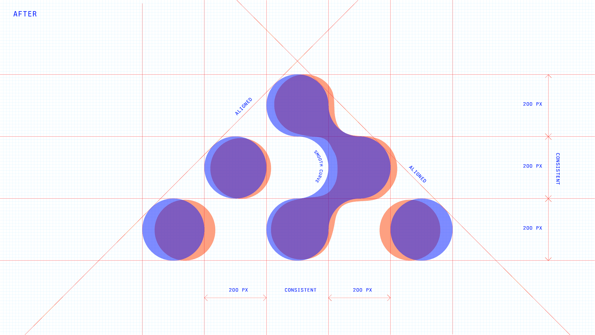
Nodes were misaligned, inconsistently positioned, and upon closer inspection it was easy to see that the curves in their connective tissue were not smooth. While I spent some time exploring alternative logos, I came to realize that fixing these issues were the top priority.
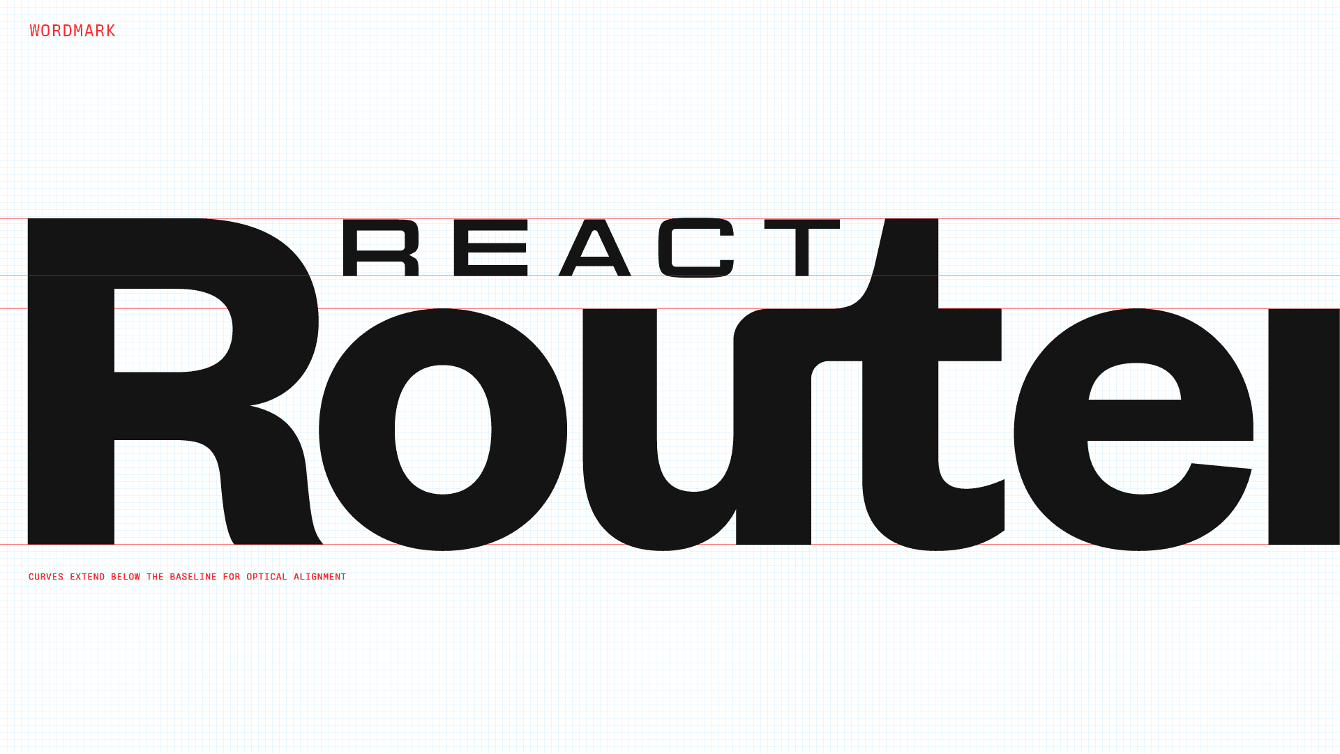
Inspired by the ancient "compact disc" logo, we embraced a method of nesting the word "React" and emphasizing "Router" as the more significant idea. Visually, this was an elegant way of reconciling the long width issue while establishing a more accurate hierarchy for the identity. I kept some usage of Founders Grotesk and created a custom ligature that more comfortably allowed for nesting. Connecting the "u" with the "t" is also a visual reference to the way nodes connect in the logo.
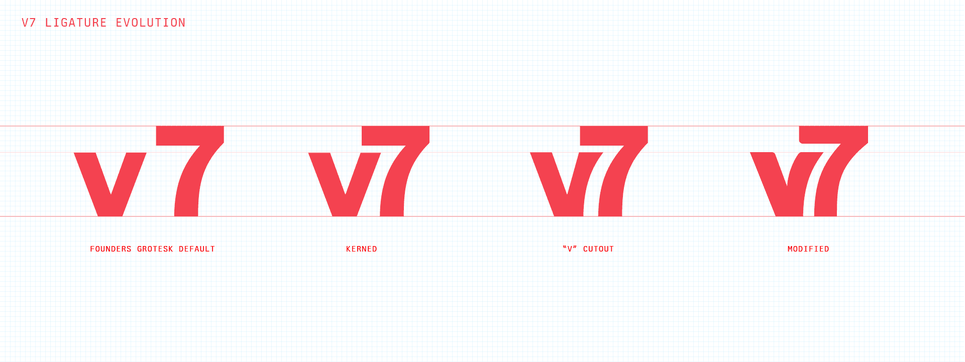
I included the evolution of the "v7" ligature to illustrate where I initially saw an opportunity. When initially typing the characters "v" and "7", the default letter spacing made them feel like separate objects at an uncomfortable distance apart. When kerning them together, nesting started to emerge as an obvious direction. There were nested elements in the wordmark, so nesting elements here seemed conceptually sound as well. The task of refining this was then an issue of finding a balance between keeping the characters consistent with the proportions for the rest of the lockup, while customizing the characters to feel like they belong together.
I'm happy with the way this brand update turned out because the process is a reflection of the way the Remix team works. Far from being linear, this task meandered playfully without compromising detail and intentionality. Perhaps more importantly, it's a true evolution—one that allows us to be more flexible and creative about our identity—without losing sight of how we got here.


